Behind the Design: Floral Series
Behind the Design: Floral Series
Creating the design for the floral series was a lot of fun and a bit of a learning curve, but extremely rewarding watching it come to life in a magnificent and unique way.The process, as always, started with a rough idea and a sketch. My goal was clear: I wanted a realistic looking floral print. Since I was building this design off of a previous one, the siren and city in letters, my first "sketch" was done on the computer.

I started with a generic rose print I sourced online and it looked exactly like that. I tried many different online floral prints, none of which resonated. I wanted something that looked like a photo of flowers, that spoke to nature. I didn't want wallpaper flowers. I actually left this design sitting there in limbo for quite some time, waiting for the next creative spark to solve my dilemma.
This spring while out walking I came across the flowers pictured below in full bloom and captured a photo. I had not intended to use it in this design, but realized later I wanted to give it a try.
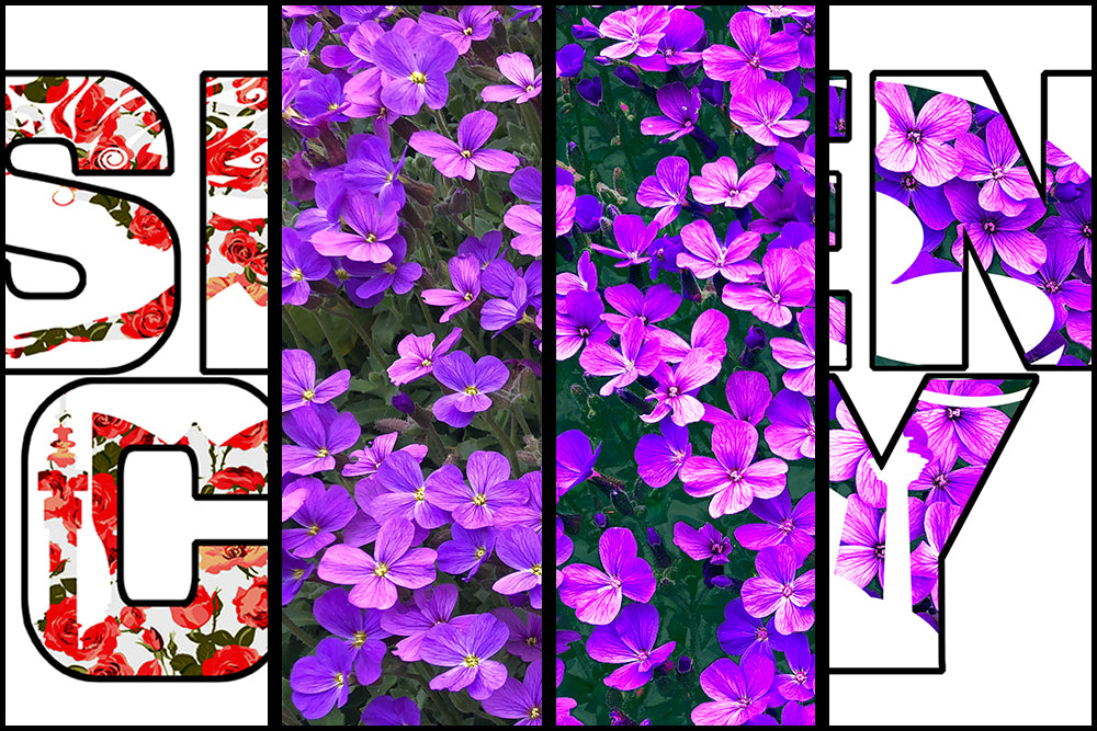
Taking a picture for screen printing becomes a problem because of too much colour variety and I needed to simplify. You can notice in the original photo (left side) the multitude of purples, greens, pinks, the yellow at the center of the flowers and black shadows. The first step in simplifying was using Photoshop image mode 'indexed colour' and restricting the image to around 10 colours.
You can see the change below, original on left, indexed on right.

That helped a lot, but there was still too much variance and some computer processing ugliness. So I selected four colours for my palette and began to hand brush (in Photoshop color mode) any areas that didn't conform. This had me zoomed in to the pixel level at times turning shadows from black to purple, cleaning up inconsistencies and solidifying definition. It also allowed me to choose petal colours, from purple to pink or vice versa, to create contrast. It was a subtle difference, but it made the design much more defined and made it pop. Before and after this process is visible below.

You can also see I changed where the floral pattern fell, whether in the design or in the letter for the letters I, C & T. The bottom example is cleaner, brighter and tells the story of the design with more clarity. It also shows off more flowers, which was the whole purpose.
With help from Malinda, my design partner, who is an expert in colour tone I pick my shirt colours based on the design, not before, and make sure they fall into the same colour palette ensuring nothing clashes.
At this point I hand it off to my local screen printer (stylenprint.com) who is responsible for breaking each individual colour into distinct colour layers. They delivered a final product without sacrificing any of the details of my original design. Beware, not all screen printers are equal in results.
Having summarized the process it sounds simple. However, I tried a lot of things that didn't work before finding these steps that delivered the results I wanted. It was a lot of hours to get a finished design.
Regards, Phil

